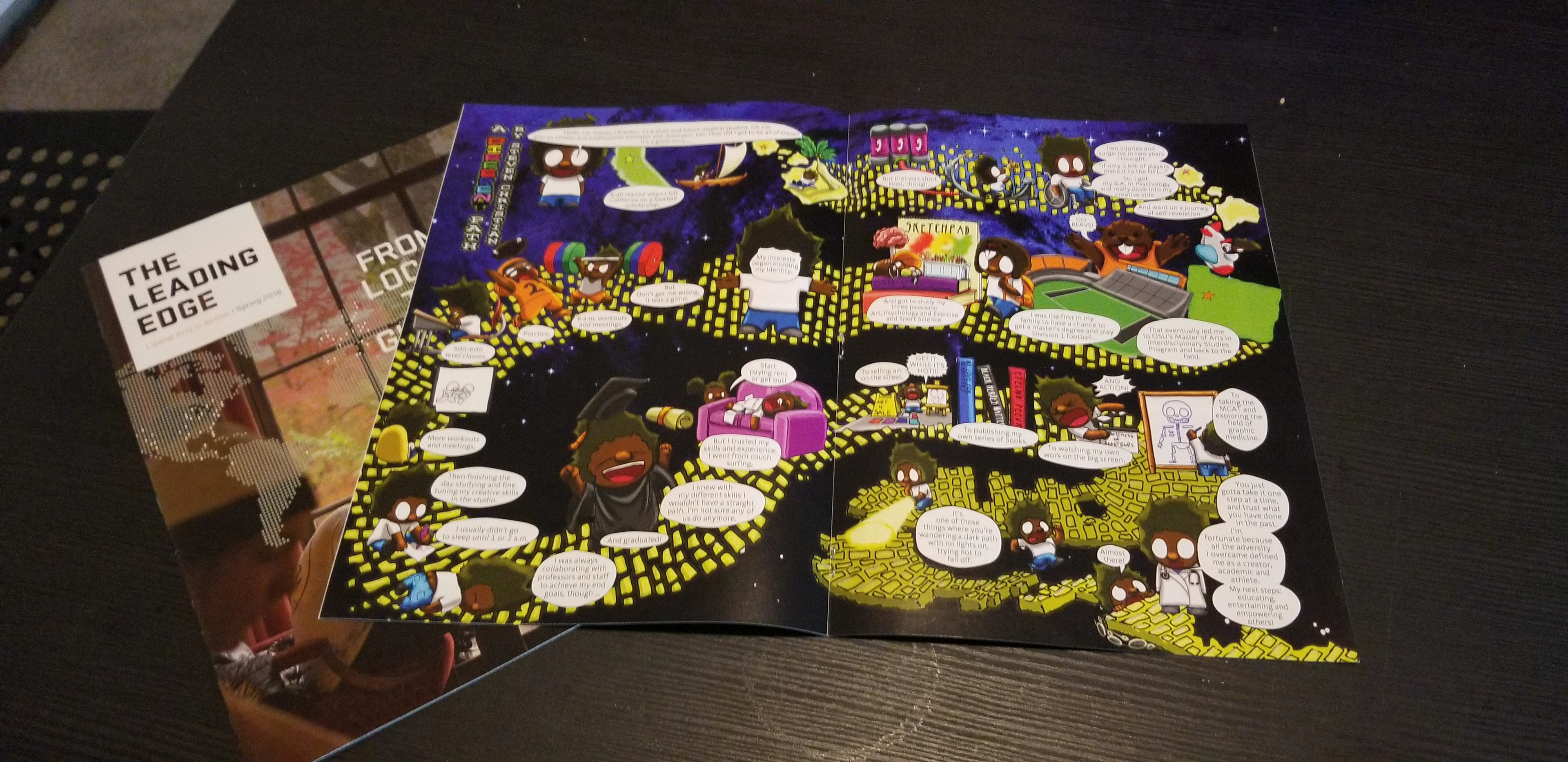

As a former football player at Oregon State University, I was the only person to play football and be a second-year grad student. On top of that I overcame two hip surgeries to earn a starting position on the team. During that time, I had a weekly comic strip I did for the paper. Flash forward 4 years, I was contacted by the Oregon State Alumni Association to work on a project for their Alumni Magazine. Essentially, they wanted me to tell my story in a way that engages prospective students and alumni at Oregon State. They saw my journey as a success of their program, and they wanted to support me through my work.
What was the role:
Writer, Character Design, Book Design, Illustration, Lettering, and Colorist.
Writer, Character Design, Book Design, Illustration, Lettering, and Colorist.
What was the process:
Like many of my comic book projects, it started with writing the ideas. I sent the OSU person I was working with a list of key points and she transcribed an interview I did with follow up questions. Afterwards, I was sent a transcript with some highlighted points they wanted me to include. After a few drafts to parse down the pages of information, I began drafting the visuals. I started in Adobe Photoshop with a double page spread. Since it was about my journey, I instantly though about the yellow brick road from the Wizard of Oz and how I followed that to the point I am at now. I felt it was an easy way to show all the adversity and nuances of my journey because it shows a complex path of me going from the top left corner of the page to the bottom right corner of the page in a time longer than expected.
Like many of my comic book projects, it started with writing the ideas. I sent the OSU person I was working with a list of key points and she transcribed an interview I did with follow up questions. Afterwards, I was sent a transcript with some highlighted points they wanted me to include. After a few drafts to parse down the pages of information, I began drafting the visuals. I started in Adobe Photoshop with a double page spread. Since it was about my journey, I instantly though about the yellow brick road from the Wizard of Oz and how I followed that to the point I am at now. I felt it was an easy way to show all the adversity and nuances of my journey because it shows a complex path of me going from the top left corner of the page to the bottom right corner of the page in a time longer than expected.
The composition took about 5 different drafts before I settled on one that OSU liked. The hardest part was trying to tell a story that is quirky and passionate without it being too wordy and preachy. I wanted people to follow my journey with their eyes and attention, but not dwell on specific sections because it was too complicated to understand. As a storyteller, much of the work is on the presentation. If someone gets lost in the journey, the whole purpose ends up being for nothing.
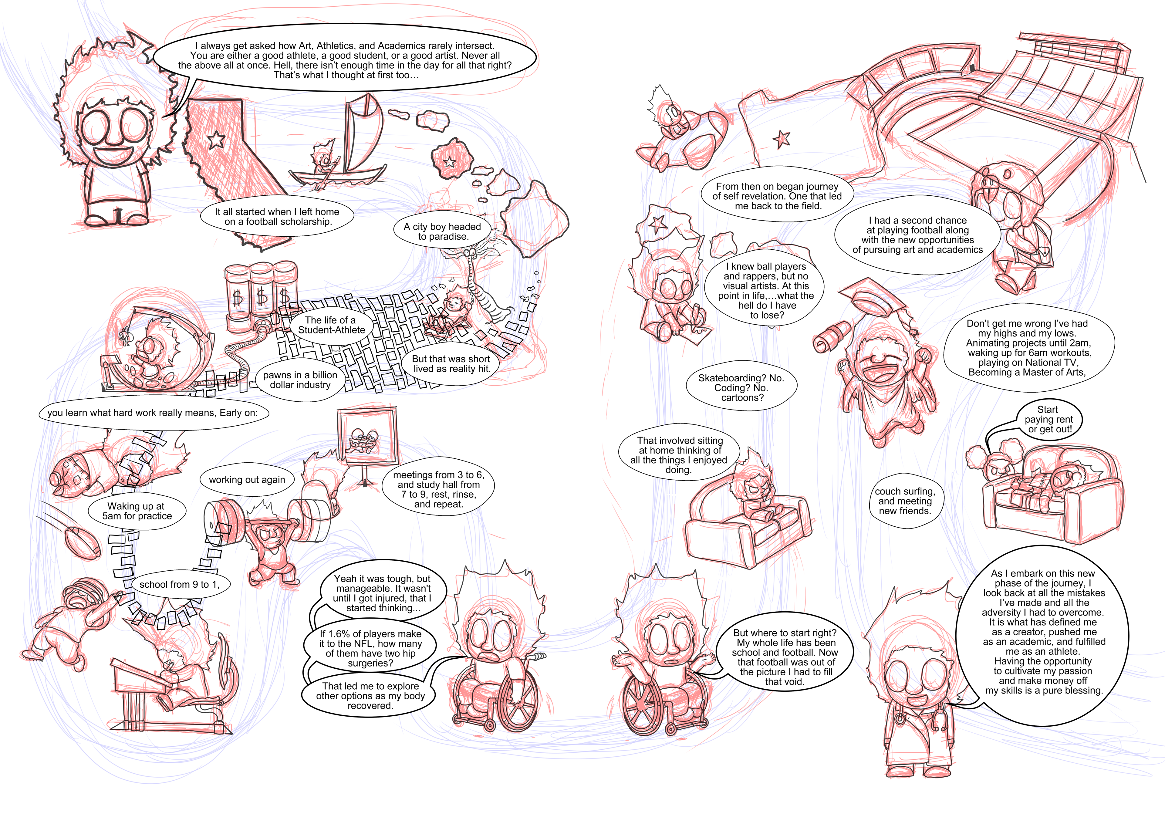
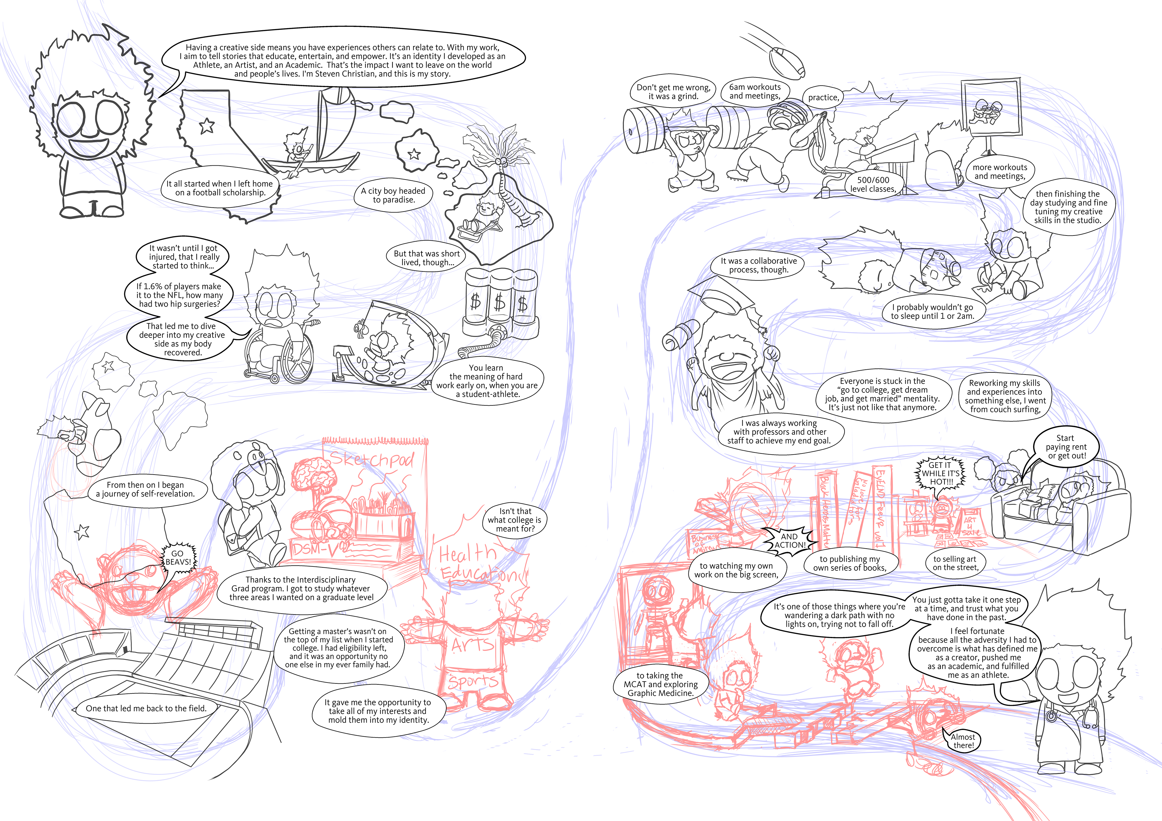
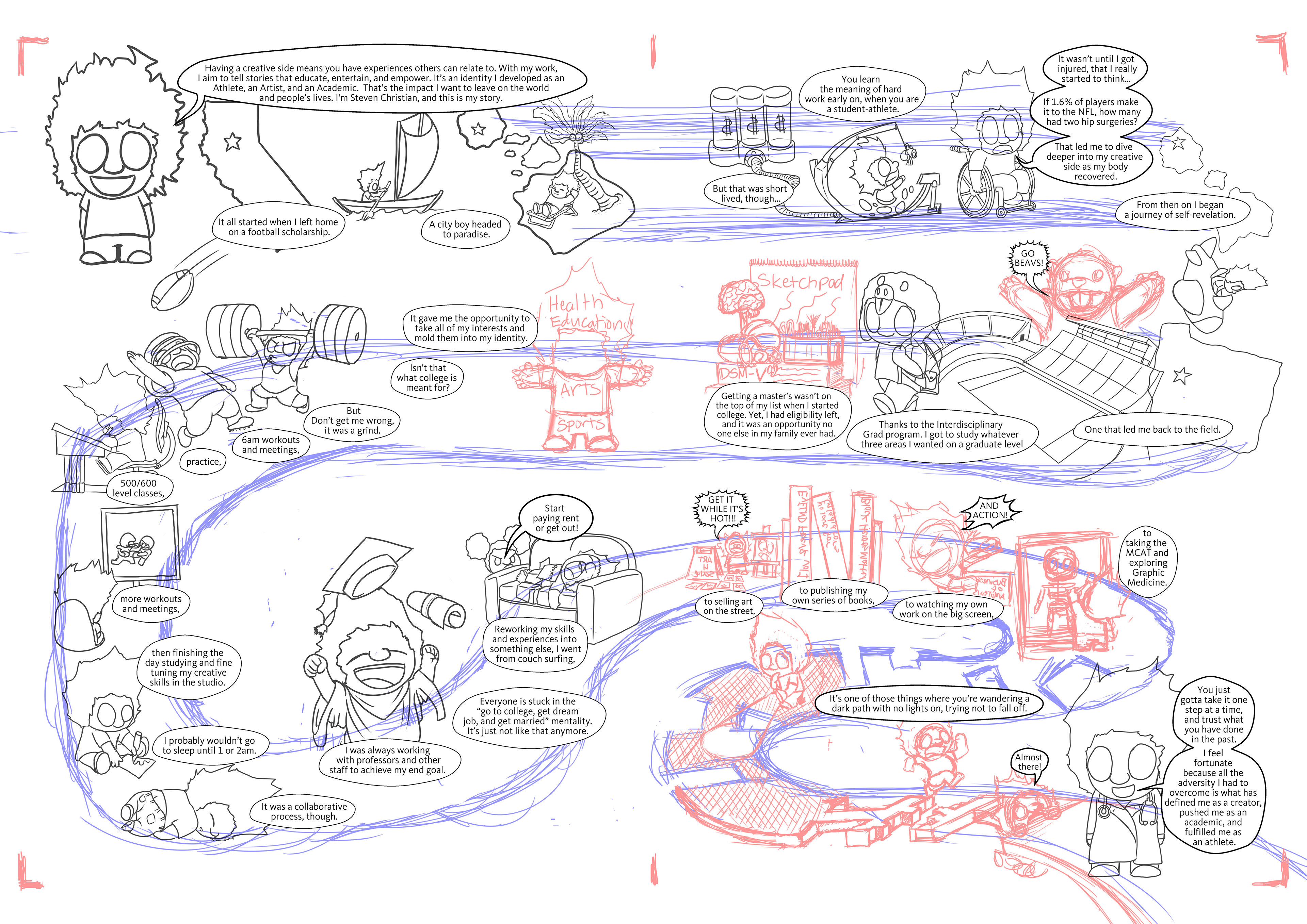
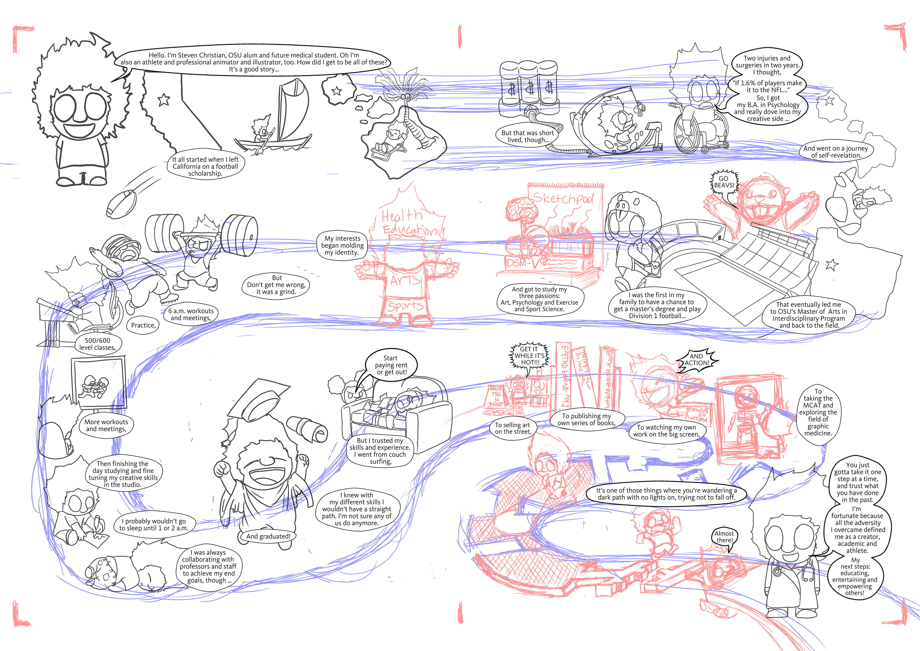
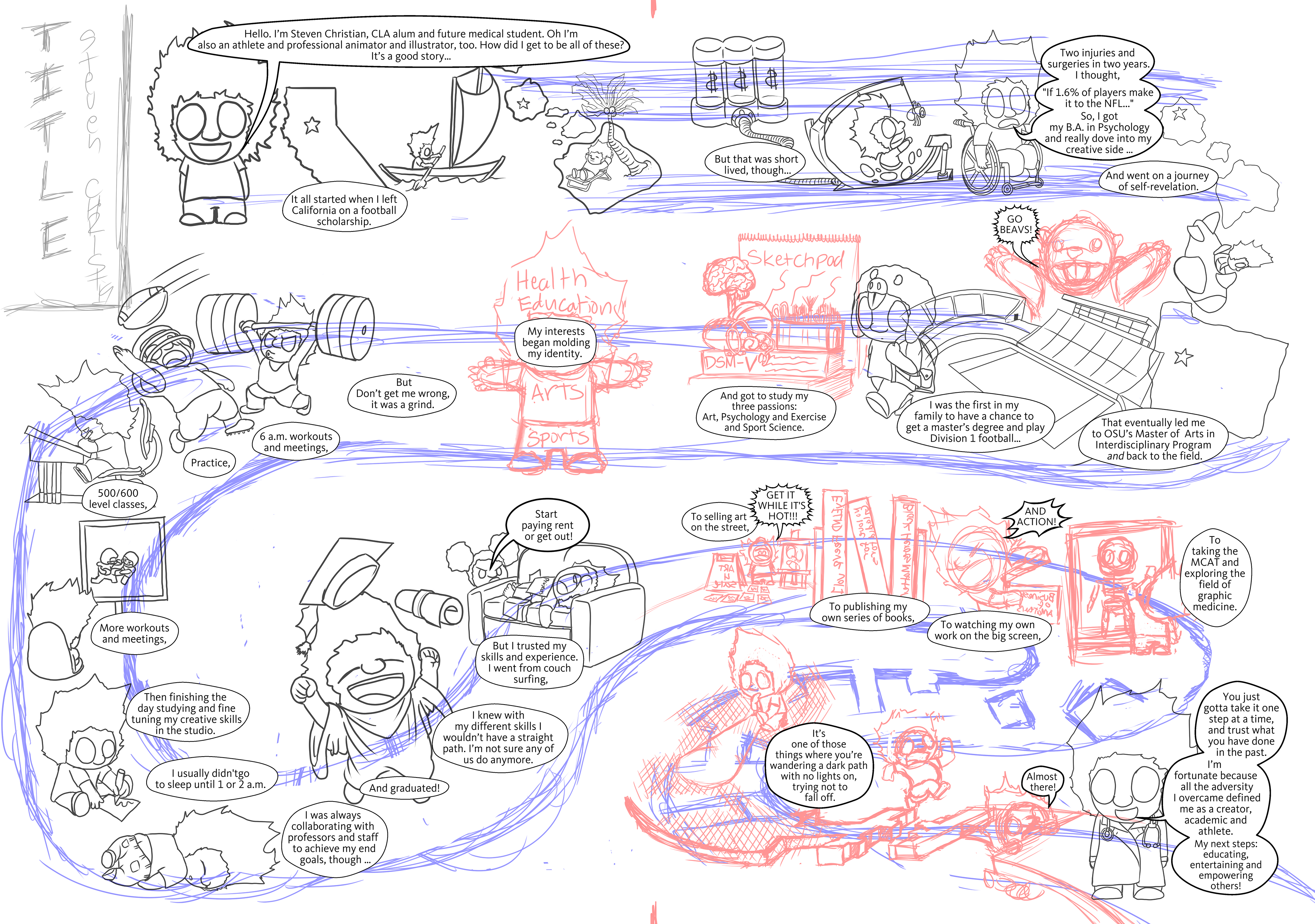
After I settled on the design, I brought the sketch into Clip Studio Paint to do the linework. Adobe Photoshop is great for many things, but I can’t get clean vector lines from a rasterized program. After the final linework is done, I bring the file back to Photoshop to color. I had very little issues with the coloring process since I use a consistent color palette with my work. Heavy emphasis on color and saturation to create expressive, vibrant contrast. I added a space themed background because, during that time it felt like I was always working eggshells during my journey. Being a college athlete puts you in the limelight especially at a major division 1 program. Any mishap could derail the path I embarked on. With my injuries, it forced me to take many routes I never expected to take. If I would have quite or got distracted, I could have easily fallen off my path.
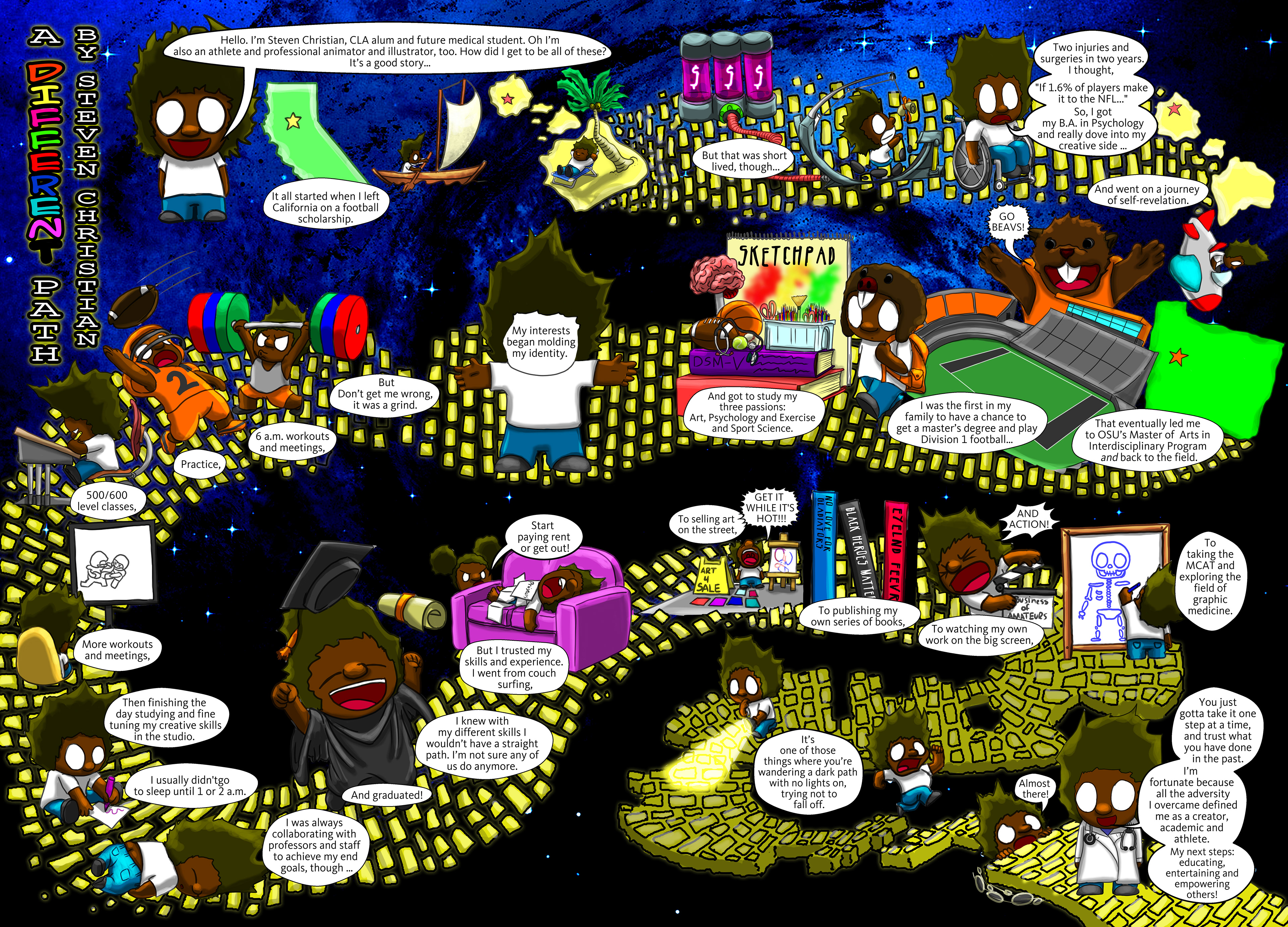


Obviously, because it goes into print, I had to play with margins and dialogue a bit after so that the key elements fit the printing guidelines with the book format.